Fintech
A fintech case study introducing a budgetingfeature for Inecobank’s mobile app to help users better understand and control their spending.

Designing a budgeting experience for InecoMobile
InecoMobile is a trusted digital banking app that allows users to manage their everyday financial tasks, including transfers, bill payments, loans, and account management. For many users, it is the primary tool they rely on to handle daily transactions quickly and securely.
However, while the app provides access to detailed transaction data, it does not support users in understanding their overall financial behavior. Spending information is available, but it is presented in a way that requires users to interpret the data on their own. There is no clear overview of monthly spending, no categorization that highlights patterns, and no tools that help users plan or monitor their budget over time.
This gap becomes especially important when managing personal finances feels overwhelming. Without clear insights, users may avoid reviewing their spending altogether, relying only on account balances rather than making informed decisions. The absence of budgeting tools limits users’ ability to feel confident and in control of their finances.
The goal of this project was to design a budgeting feature for InecoMobile that helps users better understand and control their spending. The solution needed to feel native to Inecobank’s existing interface, respect the sensitivity of financial data, and provide simple, intuitive insights tailored to local users. Rather than adding more data, the focus was on turning existing information into clear, actionable understanding.
Role: UX/UI Designer (End-to-End)
Project Duration: 3 weeks (UX Academy project)
Task: Add a feature — Budgeting experience for InecoMobile
Tools: Figma, FigJam, Maze
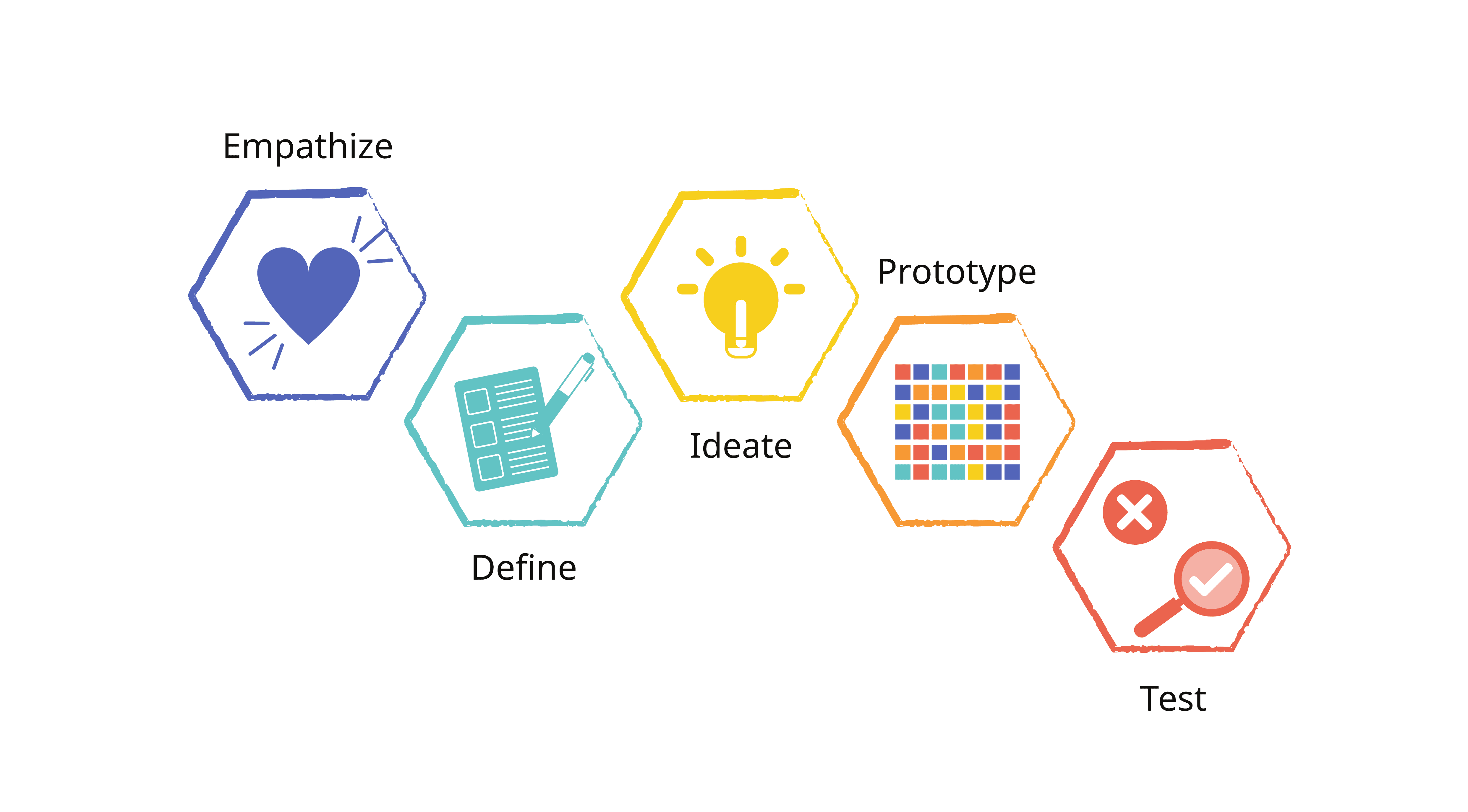
My Process
I followed the Design Thinking process, which includes five key stages: Empathize, Define, Ideate, Prototype, and Test ensuring each design decision was grounded in user needs and feedback.
Research
Understanding how users track spending
The goal of the research was to learn how existing Inecobank users monitor their spending today and what types of spending insights are most valuable to them, in order to design a visualization feature that helps users better manage their finances directly within the app.
What I wanted to learn
The research focused on understanding:
• How users currently track their spending, both inside and outside the app
• What frustrations users experience when reviewing transactions
• What kinds of insights users expect from a banking app (categories, trends, summaries)
• Whether users rely on external tools for budgeting and why
• What situations motivate users to pay closer attention to their spending
Research methods
I began with a competitive analysis to understand how modern financial apps present spending insights and budgeting features. Next, I conducted user interviews with InecoMobile users to learn how they currently track and manage their spending. Insights from these interviews were then synthesized through affinity mapping, which helped identify recurring behaviors, pain points, and unmet needs related to spending awareness.


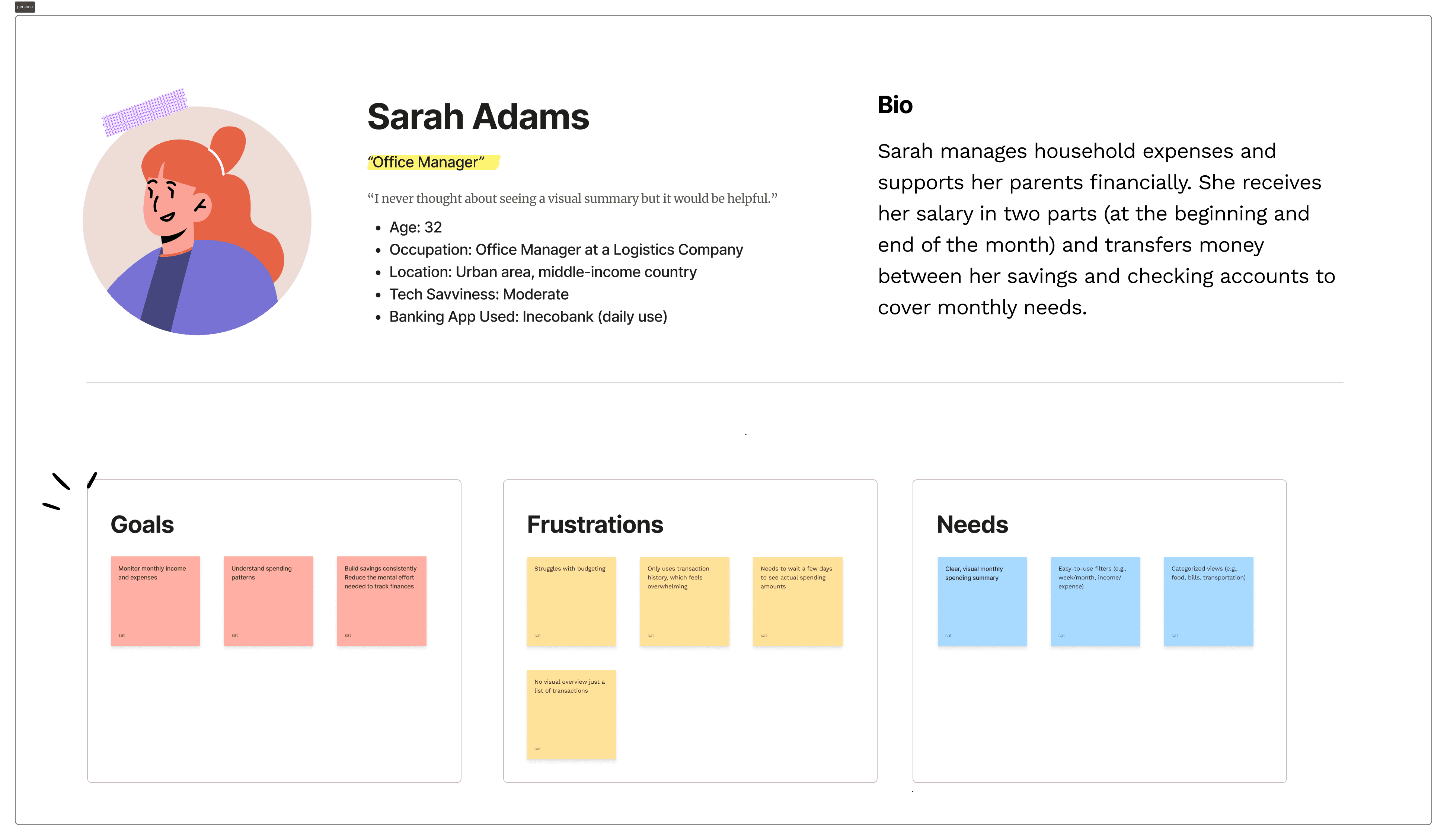
From research to persona
After analyzing interview findings through affinity mapping, I created a primary persona that represents the most common behaviors and needs observed during research.
The persona reflects users who:
• Regularly use InecoMobile for daily transactions
• Do not actively budget but want better financial awareness
• Feel unsure about spending patterns
• Respond positively to structured insights and goal-based tools
Define
Clarifying how users should manage their money
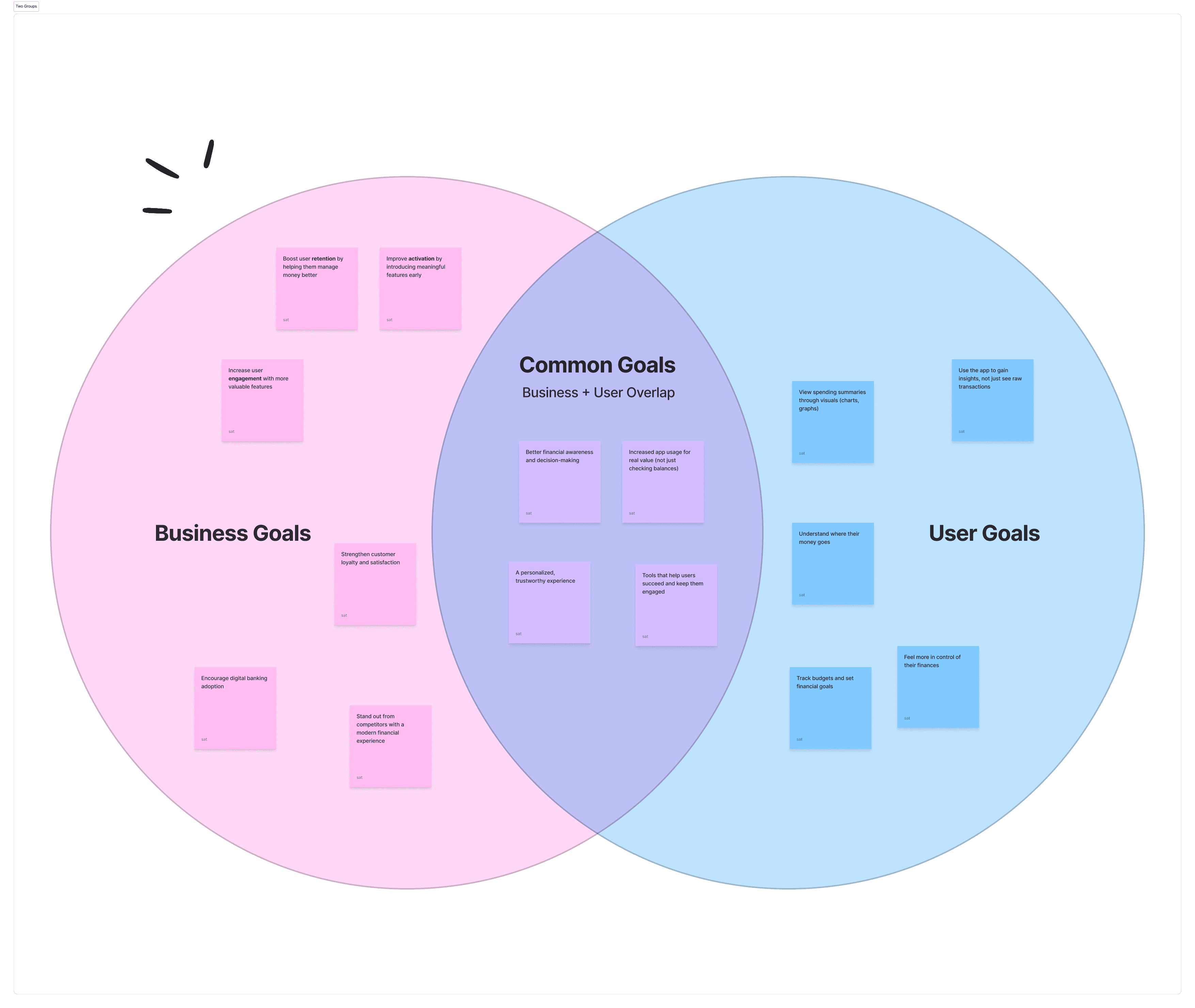
Before designing screens, I needed to clearly define what “better money management” actually meant for InecoMobile users. Research showed that people rely heavily on transaction history, but struggle to see patterns, plan ahead, or feel in control of their spending. The challenge wasn’t missing data — it was missing structure.
To sharpen the direction, I began by aligning user needs, business opportunity, and feasibility using a Venn diagram. While users didn’t explicitly ask for budgeting tools, interviews revealed strong excitement when visual summaries, spending limits, and goal-based tracking were introduced. At the same time, helping users better understand their finances supports engagement and strengthens InecoMobile’s competitive position. This alignment helped define a clear objective: transform raw transaction data into meaningful financial visibility.
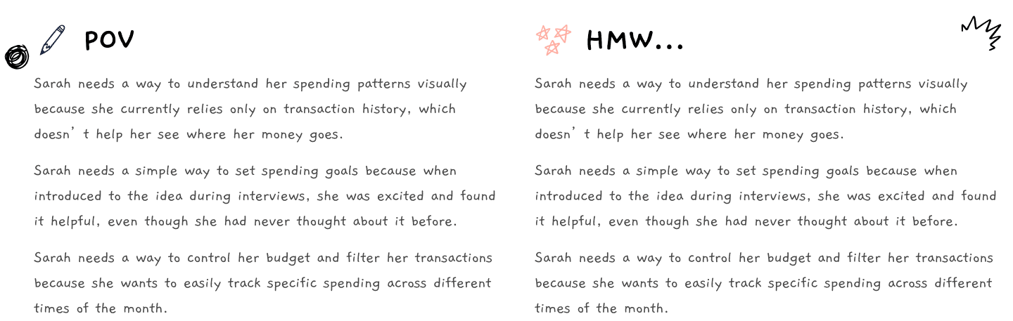
With that focus in place, I translated research insights into a clear Point of View statement, centered around users who want to understand their spending visually but currently rely only on history. These needs were reframed into targeted How Might We questions to guide ideation — ensuring the solution addressed clarity, control, and simplicity rather than adding unnecessary features.
Finally, I converted those HMW questions into a structured feature set and prioritized them using the MoSCoW framework. Core features such as categorized spending, analytics dashboard, filtering by date and category, and budget setting were defined as Must-Haves. Goal-based tools and salary-cycle views were positioned as secondary enhancements, while contextual tips and dark mode were categorized as future delighters.
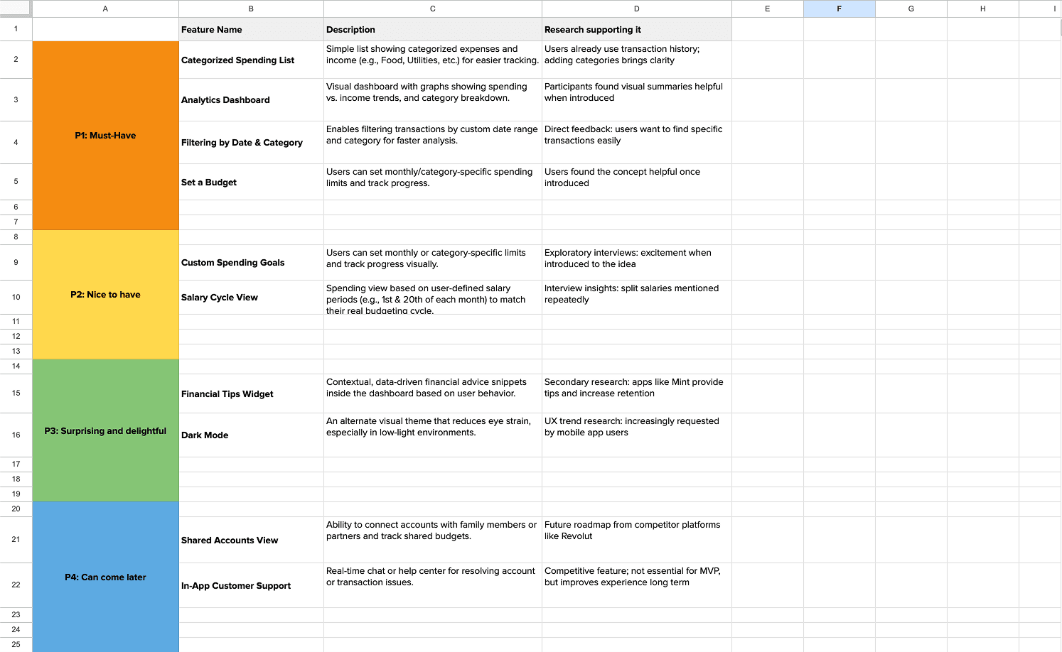


IA
Structuring a clear spending experience
With the feature set defined, the next step was to structure how users would actually navigate and interact with the budgeting functionality. The goal was to keep the experience intuitive, reduce cognitive load, and ensure that checking spending or setting a budget required minimal effort.
I began by mapping the Information Architecture, integrating the new budgeting components into the existing InecoMobile structure. Rather than creating a separate, isolated feature, spending insights were positioned within the natural “Spending” flow to maintain familiarity and trust.
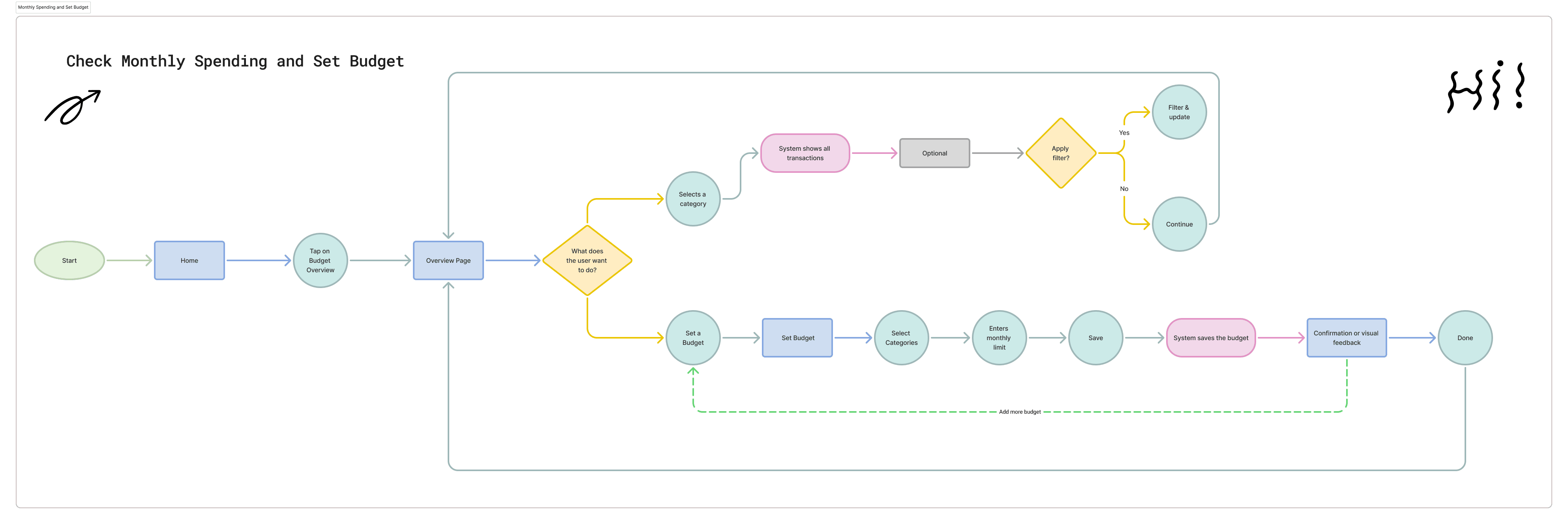
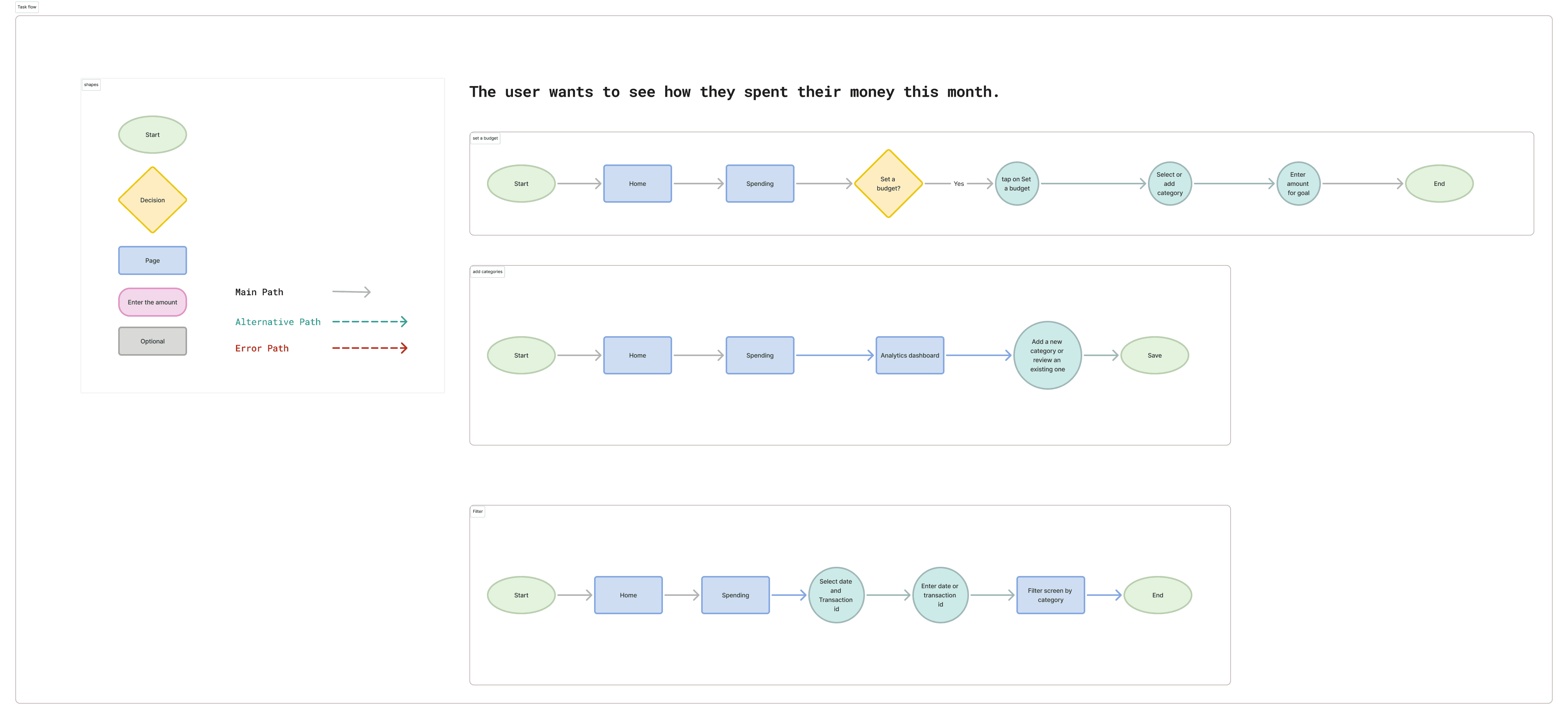
Next, I broke down the experience into clear task flows to understand how users would complete specific actions such as setting a budget, adding categories, or filtering transactions. This helped ensure that each action had a logical sequence and avoided unnecessary steps.
Wireframe
Designing a Budgeting Experience Users Can Trust
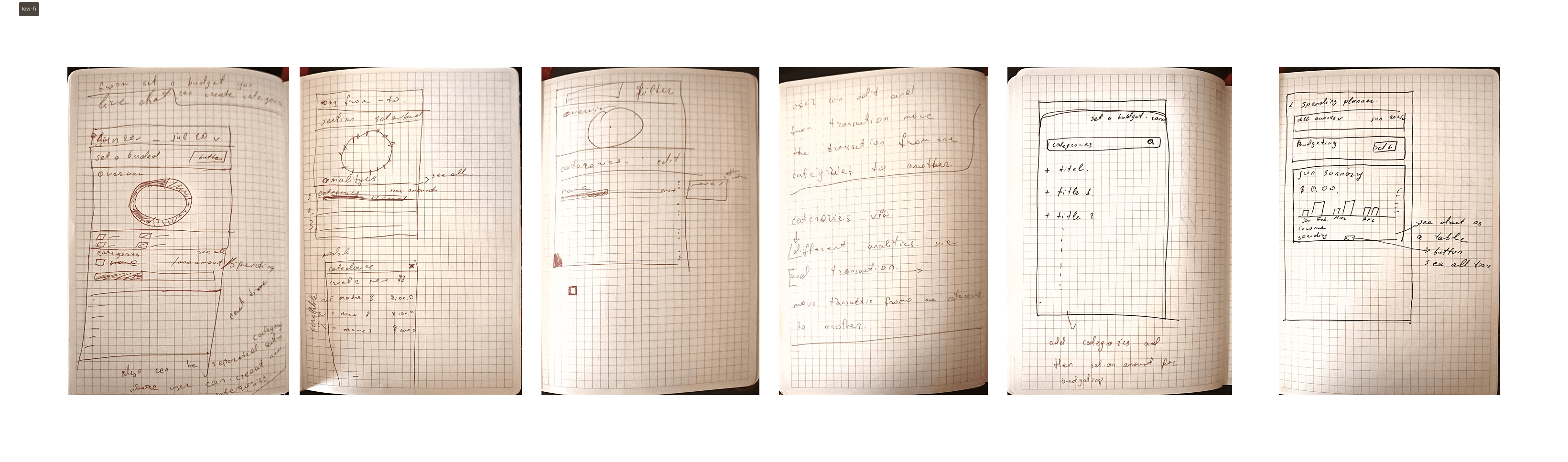
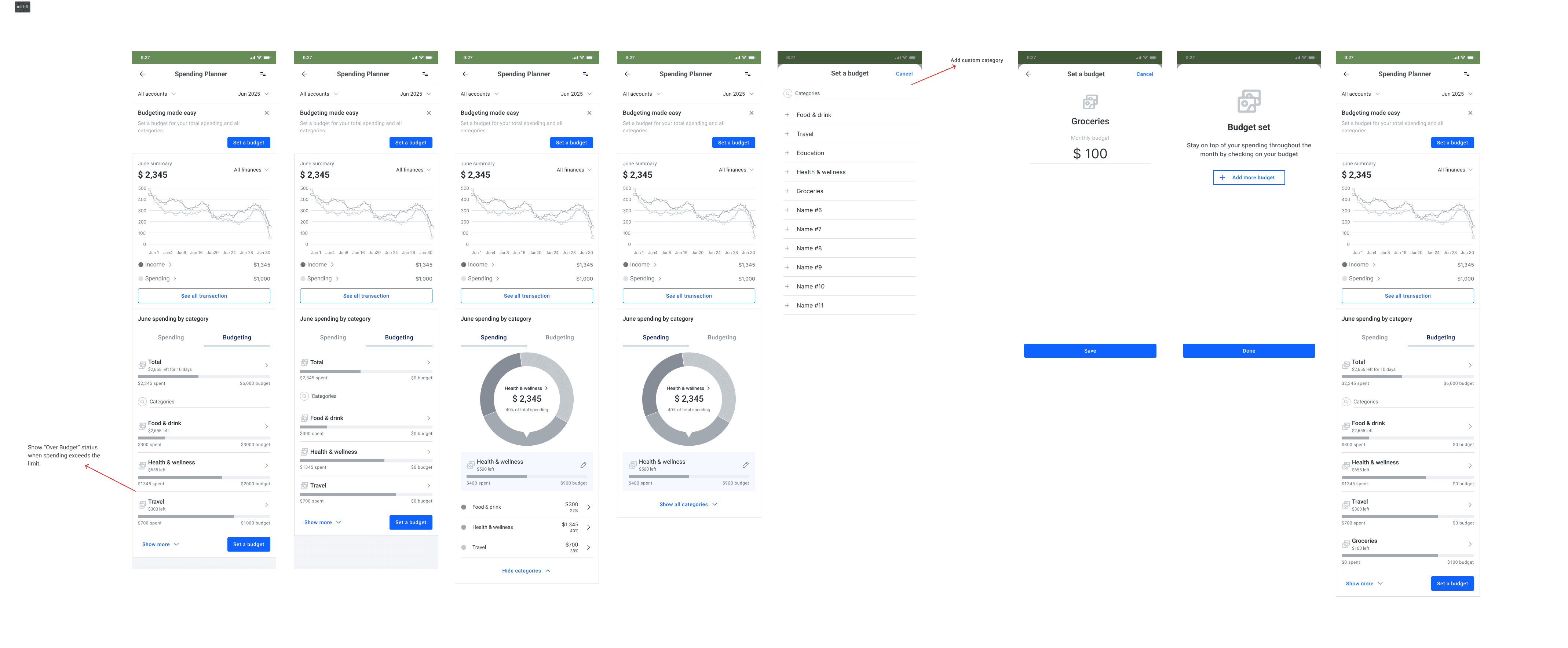
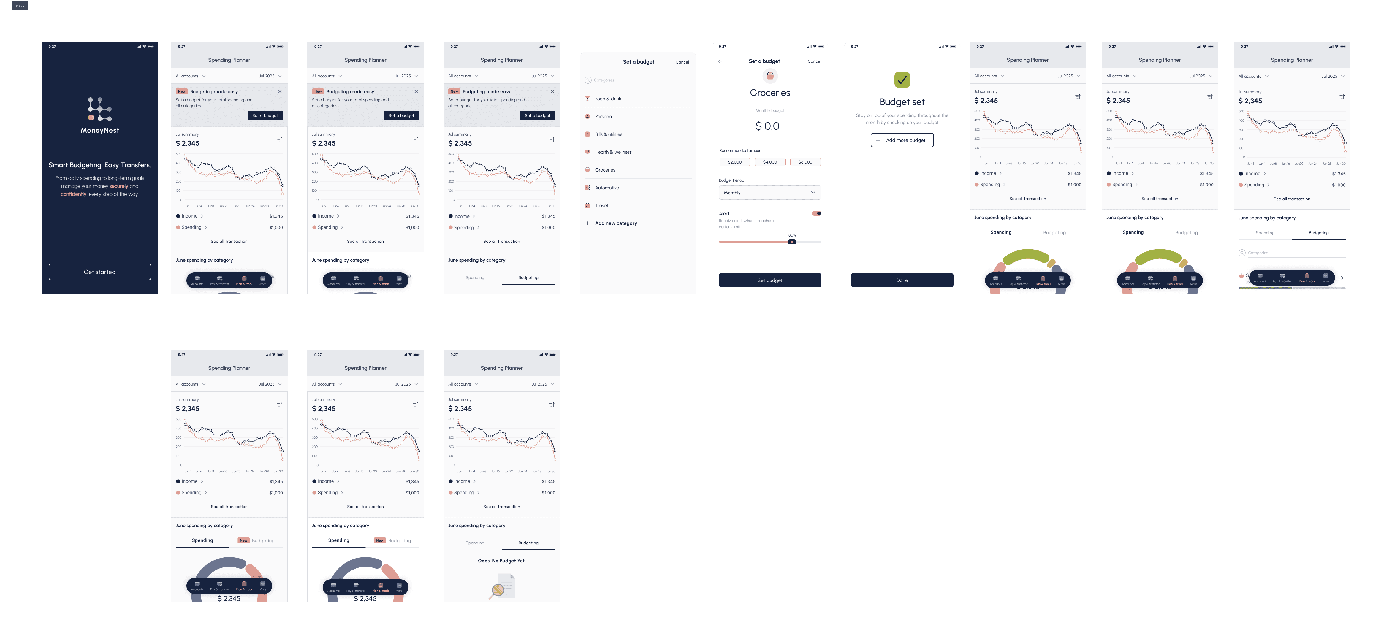
Based on the defined flows and prioritized features, I designed the first version of the budgeting screens. The focus was on making monthly spending immediately visible while keeping interactions simple and familiar within the InecoMobile interface.
The main overview screen highlights total monthly spending and category breakdowns, allowing users to quickly understand where their money goes. From there, users can filter transactions or move into setting a budget. The initial version prioritized clarity over complexity, ensuring users could explore insights without feeling overwhelmed.
Testing and Refining the Budgeting Experience
To validate the first version of the budgeting feature, I conducted usability testing with five participants — two current Inecobank users and three users of similar banking apps, aged 25–40. The goal was to understand whether users could easily set a budget, interpret visual feedback, and use filters without confusion.
Most participants were able to complete the budget setup flow without guidance. Navigation between spending insights and budgeting felt smooth, and the visual summaries — particularly the pie chart — were described as intuitive and helpful.
Testing revealed areas for improvement. Some users did not immediately understand the purpose of budgeting or how it supports financial control. The over-budget warning was noticed, but the message felt too vague. In addition, the option to add or customize categories was not clear enough, limiting flexibility and reducing confidence in the feature.
Branding
Making money management feel clear and safe
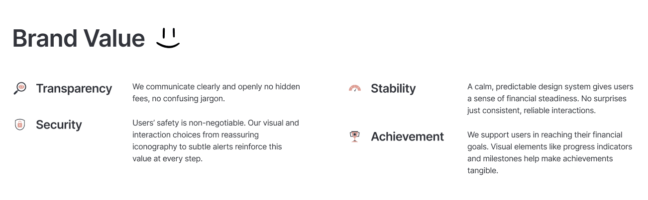
To bring the brand values into the interface, I translated Transparency, Security, Stability, and Achievement into a concrete visual system.
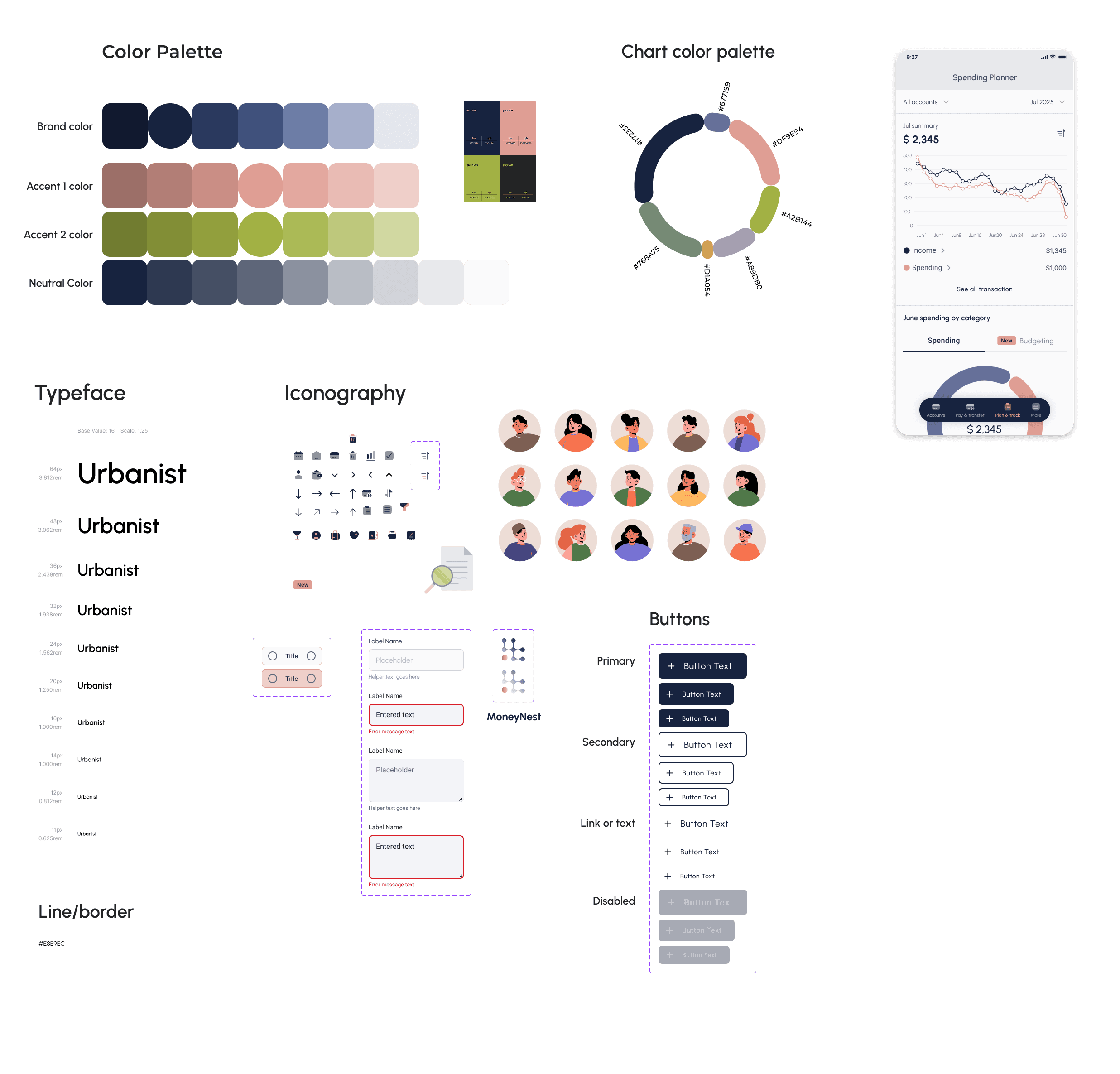
A structured blue-based palette reinforces trust and stability, while carefully selected accent colors support clarity in charts, categories, and alerts. The chart color system was designed to distinguish spending categories clearly without overwhelming the user. Neutral tones reduce cognitive load and keep financial data readable.
Typography was chosen for legibility and hierarchy, ensuring users can quickly scan totals, limits, and trends. Iconography and UI components follow a consistent, predictable pattern to reinforce security and reliability.
From these foundations, I built a small UI kit — including buttons, inputs, labels, and feedback states — to maintain consistency across the budgeting experience. This ensured that every interaction feels intentional, clear, and supportive rather than complex.
High-Fidelity Wireframe
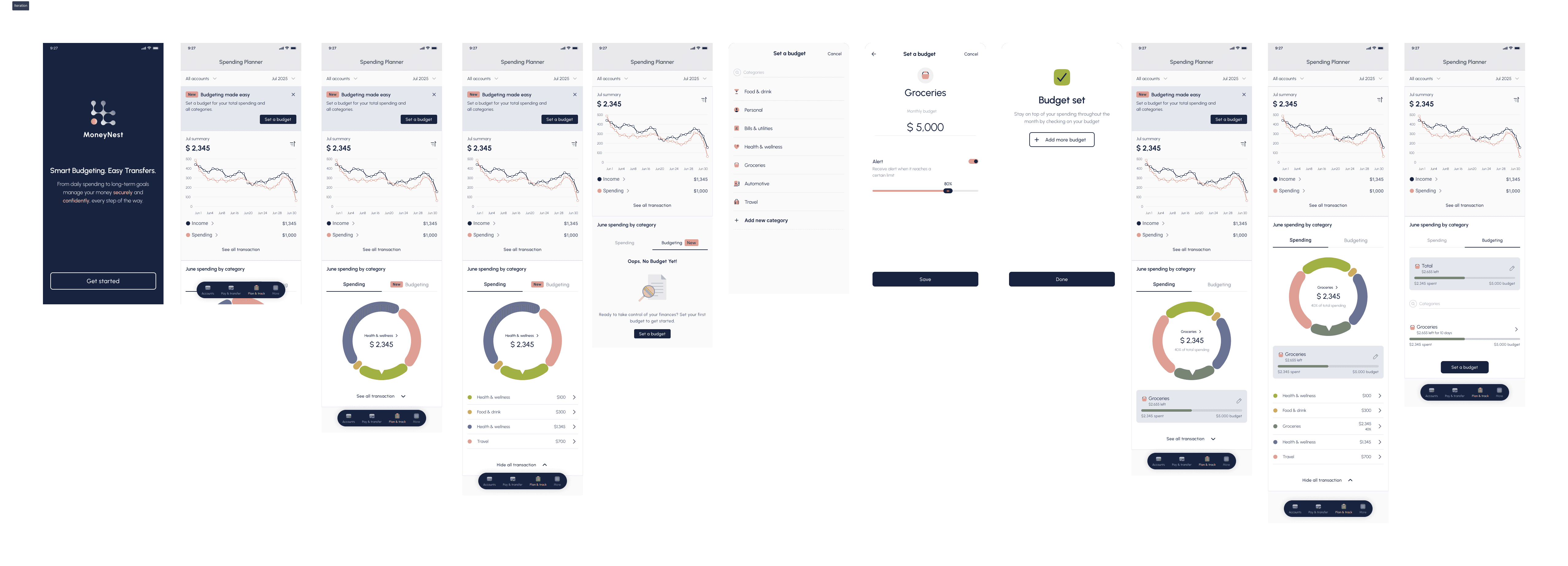
Bringing the budgeting experience to life
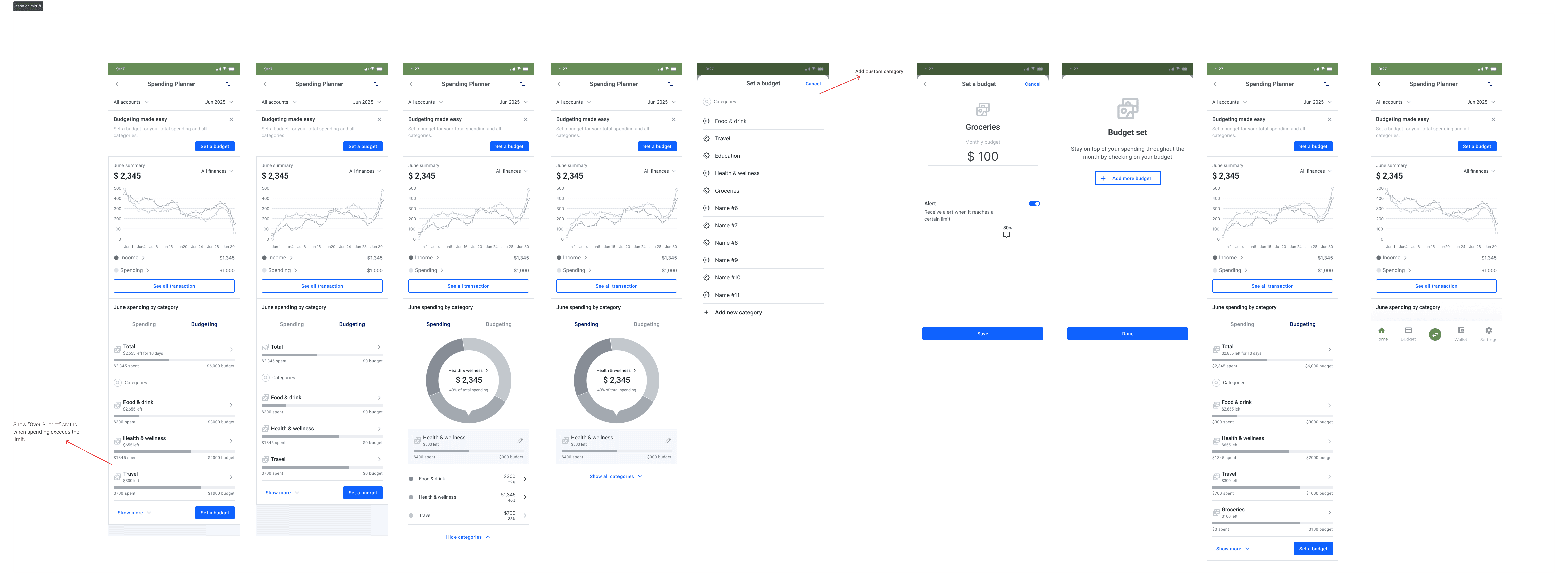
After validating the structure and refining the visual system, I translated the wireframes into high-fidelity designs. The goal was to combine clarity, trust, and usability into a polished interface that feels native to InecoMobile.
Validating the Experience with Real Users
Participants: 9
Age range: 20–40 years old
Average Time: 88.4s
Task Completion Rate: 100.0%
Error-Free Rate: 44.0%
Before finalizing the feature, I conducted remote moderated usability tests to evaluate whether users could confidently set budgets, configure alerts, and navigate between spending insights and budgeting screens.
Nine participants completed three key tasks:
setting a grocery budget, configuring a spending alert, and navigating between budget and insights views. Sessions lasted 15–20 minutes and focused on identifying friction, misunderstandings, and interaction clarity.
Iterating Based on Feedback
Based on these findings, I refined the interface to improve clarity and guidance:
• Clarified alert labeling and added contextual helper text
• Strengthened visual distinction between budget limit and alert settings
• Improved placement and visibility of the alert option
• Refined confirmation feedback to reinforce successful actions.


