leafy
Leafy is a plant care assistant designed to make plant care simple, clear, and actionable.

When Plant Care Feels Overwhelming Instead of Enjoyable
Leafy is a plant care app designed to help busy and beginner plant owners understand what their plants need and what to do next. By providing clear guidance, reminders, and actionable next steps, the solution reduces confusion and builds confidence in everyday plant care.
I worked as the end-to-end UX designer on this one-month project. My responsibilities included research, defining user needs, designing user flows, creating wireframes and high-fidelity interfaces, and conducting usability testing. The project followed an iterative process, where insights from testing continuously shaped design improvements.
Plants Were Dying — Not Because Users Didn’t Care
Many new and busy plant owners struggle to keep their houseplants healthy. They lack clear guidance, forget regular care tasks, or fail to recognize early signs of plant stress. Over time, this leads to frustration and loss of confidence when plants decline or die.
Understanding Why Consistency Breaks Down
The goal of this project was to understand how plant owners currently manage plant care, what challenges they face, and what motivates them to stay consistent. These insights guided the design of a solution that supports plant care in a way that feels simple, manageable, and encouraging.
Role: UX/UI Designer (End-to-End)
Project Duration: 4 weeks (UX Academy project)
Task: Design a plant care mobile app to help users identify plants, understand care needs, and stay consistent with routines
Tools: Figma, FigJam
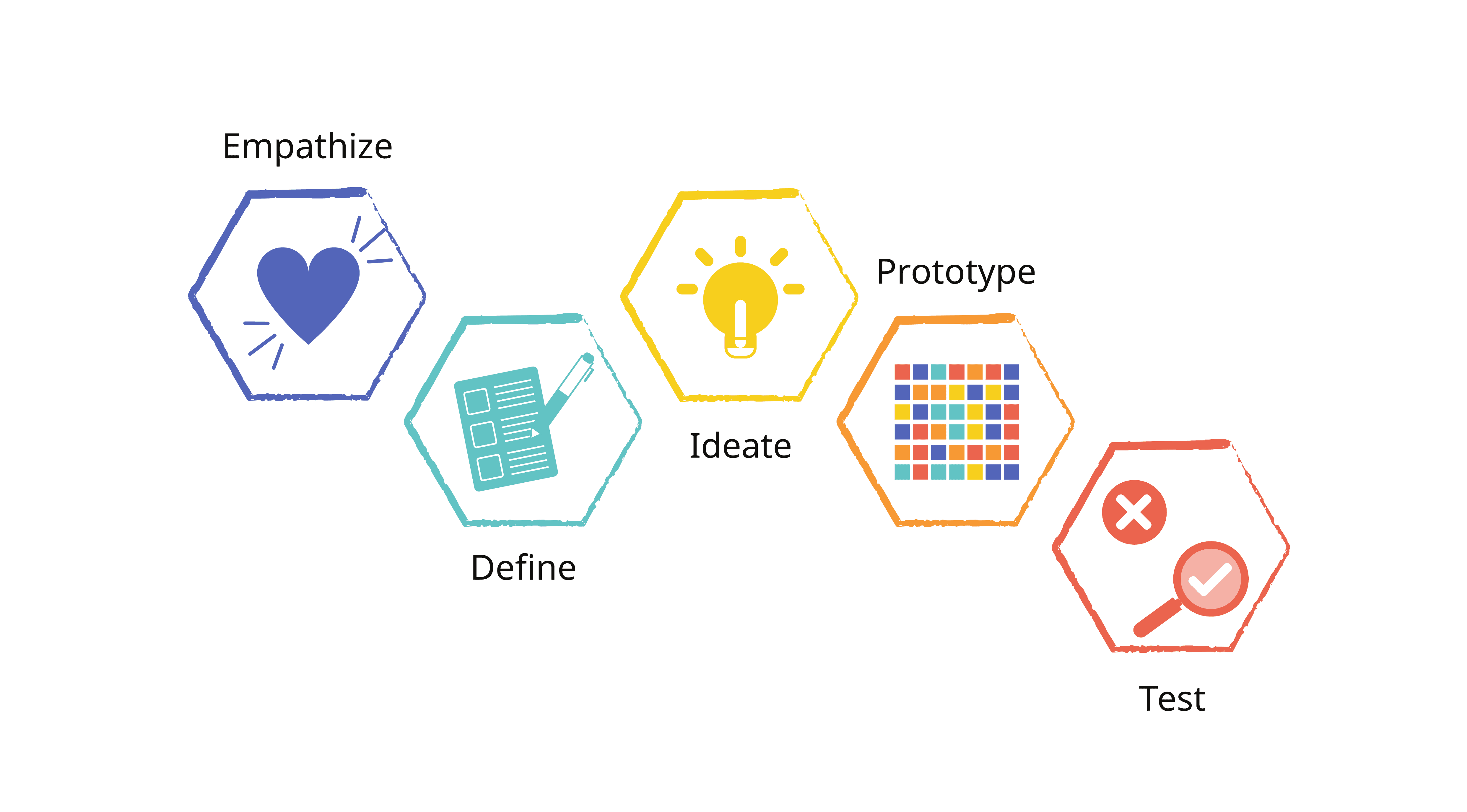
My Process
I followed the Design Thinking process, which includes five key stages: Empathize, Define, Ideate, Prototype, and Test ensuring each design decision was grounded in user needs and feedback.
Research
How Plant Owners Care for Plants — and Why It Fails
To understand how plant owners manage plant care and where they struggle, I conducted qualitative research combining user interviews, usability testing with a clickable prototype, and competitive analysis of existing plant care apps.
Testing sessions were conducted remotely, allowing observation of hesitation points, misunderstandings, and repeated questions. Competitive analysis revealed gaps in clarity, task visibility, and reminder experience across current solutions.
Findings were synthesized using affinity mapping to identify recurring themes related to plant identification, care clarity, and task consistency.


What We Learned from Users
Users prefer recognition over recall: Most could add a plant, but consistently chose Scan because they didn’t know exact plant names.
Information alone doesn’t create clarity: Care details existed, but poor hierarchy made them hard to scan and act on.
Users think in actions, not knowledge: They struggled to answer “What should I do now?” because tasks weren’t clearly surfaced.
Consistency requires support: Reminders and scheduling weren’t optional features — users saw them as essential.
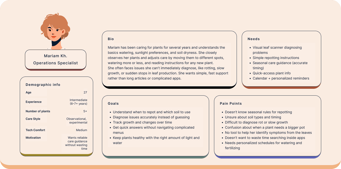
User persona
Based on research insights, I created two primary personas representing beginner and intermediate plant owners with different levels of experience, confidence, and care behaviors.
These personas helped anchor design decisions by highlighting distinct needs: beginners required structured, step-by-step guidance and reassurance, while intermediate users needed faster access to information and more flexible, diagnostic support. Keeping these differences visible throughout the process ensured the solution addressed both clarity and efficiency.
Define
Translating insights into actionable priorities
Based on research findings, I translated insights into clear project direction by mapping user goals, business goals, and feasibility considerations using a Venn diagram. This helped identify areas of overlap and prioritize ideas that addressed real user needs while supporting long-term product value.
From these overlaps, I developed a focused problem statement grounded in POV and HMW frameworks, clarifying the core challenge to solve and the direction for the solution.
To ensure realistic scope and execution, I used the MoSCoW framework to prioritize features — distinguishing must-have functionality from nice-to-have ideas based on user impact, project goals, and feasibility constraints.


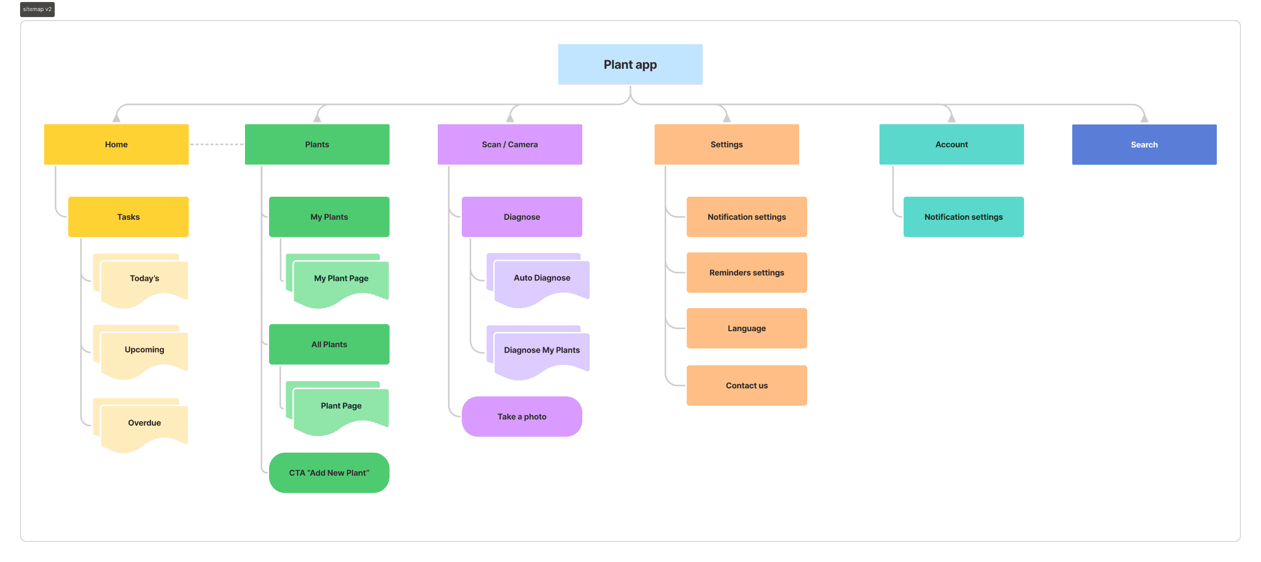
User Flow
Designing a structure that reduces cognitive load
I created a simplified sitemap to organize core screens and reduce cognitive load. The structure prioritizes quick access to plant information, care tasks, and reminders while avoiding unnecessary depth.
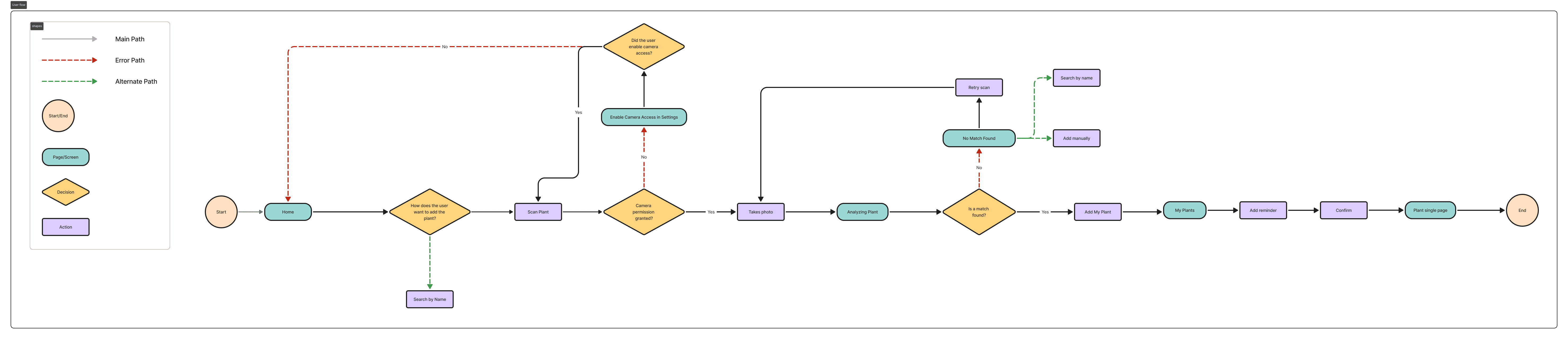
User Flow
Turning plant care into simple, guided steps
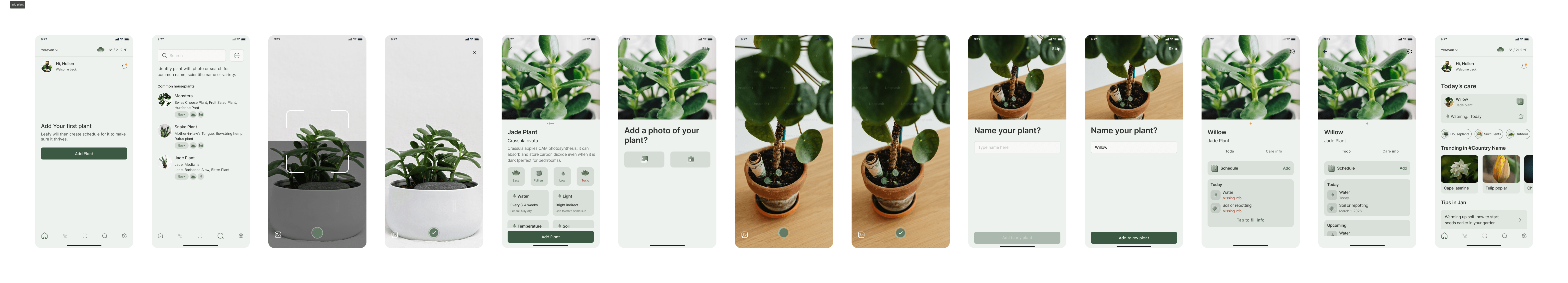
I designed user flows focused on essential tasks such as adding a plant, reviewing care details, and identifying the next action. The flows were intentionally short and intuitive, supporting users with different experience levels and reducing friction at key decision points.
Based on the user flows, I created digital wireframes and conducted early usability testing to validate structure and clarity before moving into high-fidelity design.
Early Usability Feedback
Testing revealed several clarity issues early in the process. Some users were unsure about the purpose of certain images, and the term “Diagnosis” caused confusion. There was also uncertainty around when to use Scan versus Search, and key care information was not surfaced early enough in the experience. Reminder interactions were present but not immediately clear.
At the same time, positive signals emerged. Users found the overall layout simple and easy to navigate, and the plant scanning feature was perceived as helpful and intuitive. The step-by-step structure reduced feelings of overwhelm, and users appreciated having care information, reminders, and tracking in one unified experience.
Branding
Building a consistent and scalable visual system
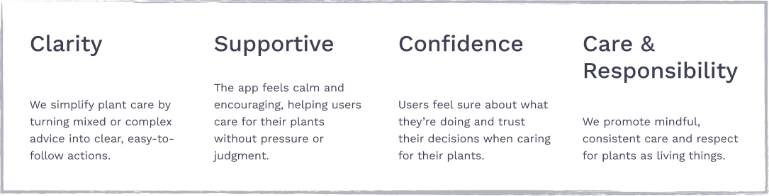
To define the product’s personality and tone, I established core brand values focused on clarity, support, confidence, and responsible care.
These principles guided visual decisions, interaction tone, and content structure — ensuring the experience feels calm, trustworthy, and actionable rather than overwhelming.
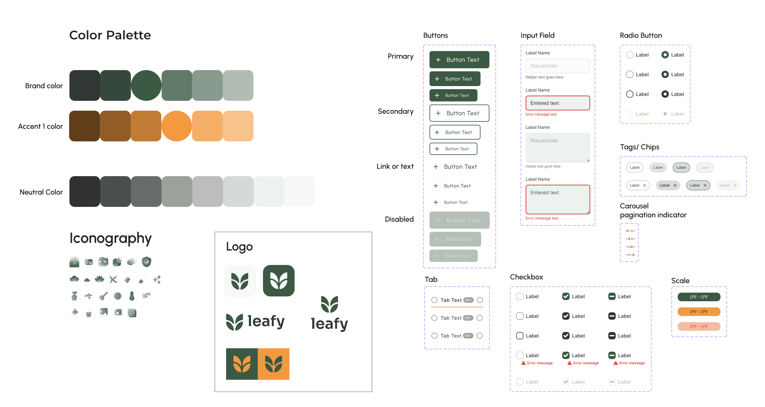
To ensure visual consistency and scalability, I created a lightweight design system defining core elements such as typography, color palette, buttons, input fields, iconography, and component states.
The primary color Forest Sage was chosen based on the brand values of clarity, confidence, and care. This deep green communicates growth, stability, and trust — reinforcing the feeling of calm guidance rather than urgency or pressure.
This system helped maintain clarity across screens, strengthen accessibility and hierarchy, enable faster iteration during usability testing, and prepare the product for future feature expansion.
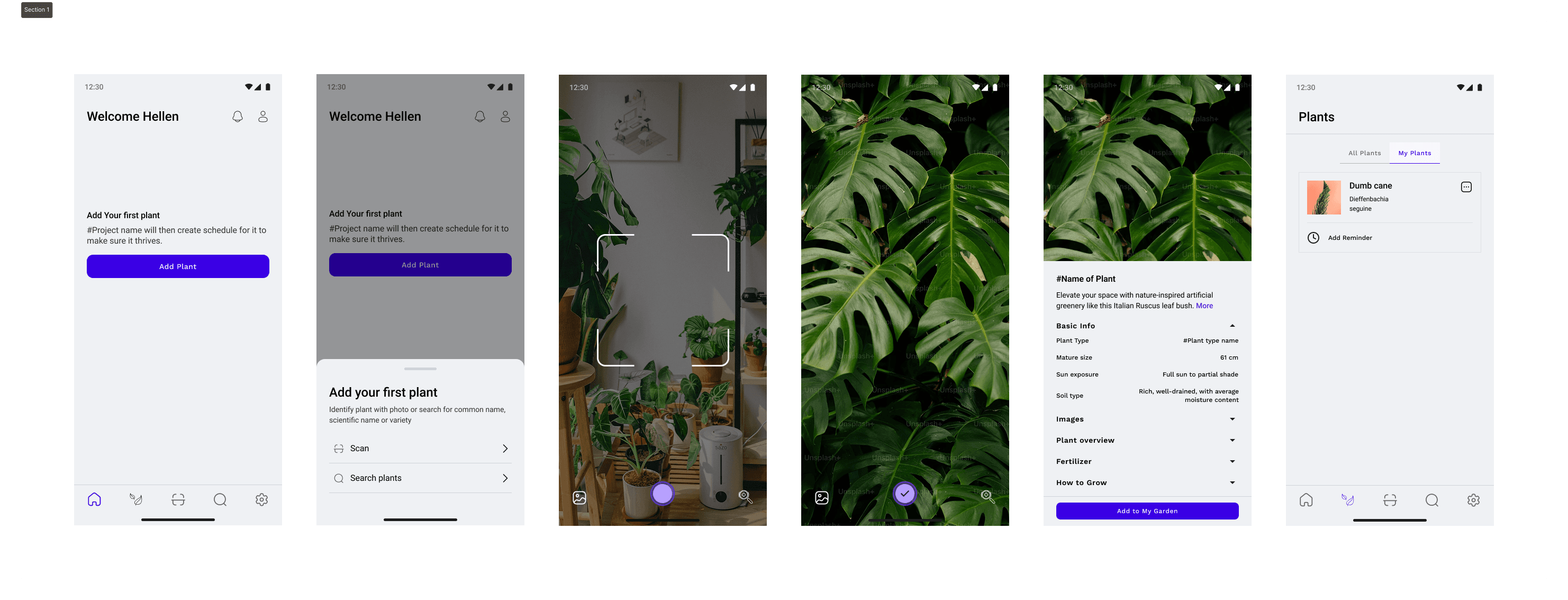
High-Fidelity Wireframe
Refining the solution through iteration
After conducting usability testing on the digital wireframes, I iterated based on user feedback and moved into high-fidelity designs. The refined interface was then tested again to validate improvements and ensure clarity before finalizing the solution.
Usability testing approach
Usability testing was conducted using a clickable prototype to evaluate key tasks such as plant identification, understanding care information, identifying next actions, and interacting with reminders.
Sessions were conducted remotely with plant owners matching the target personas, allowing observation of real behaviors, decision-making patterns, and points of confusion.
What Testing Revealed
Scan is the primary entry point. Users preferred scanning over search because plant names are uncertain and vary by language or region.
Information ≠ clarity. Care instructions were present but not structured for quick decision-making.
Users think in actions, not knowledge. They wanted to know what to do now — not read dense guidance.
Task visibility drives confidence. When next steps weren’t obvious, hesitation increased.
Reminders are core value, not a feature. Users viewed scheduling as essential support for consistency.
View Mobile Final Prototype
Final thoughts & impact
This project reinforced that effective products are built around behavior, not information. While care details were available early on, users needed clear, prioritized actions rather than dense guidance.
By reframing the experience around what to do next instead of what to know, the final solution became more intuitive and aligned with real user behavior. The process strengthened my ability to translate research insights into focused, actionable product decisions.
Future iterations
Future improvements could include smarter care recommendations based on plant health trends, more personalized reminder logic, and progress tracking to reinforce positive care habits. These enhancements would further support consistency and long-term engagement.