PlanZo
Smart Plans, Seamless Moments.

Introduction
PlanZo is an event planning platform designed to make organizing events easy, joyful, and accessible — especially for busy parents, young professionals, and small businesses planning birthdays, parties, and celebrations.
Challenge
Planning a celebration without professional help is often stressful and confusing. People don’t know where to start, how to find trusted vendors, or how to manage everything in one place. My challenge was to create a simple, guided platform that helps users plan joyful events with confidence and ease.
Role: UX/UI Designer (End-to-End)
Project Duration: 4 weeks (UX Academy project)
Task: Design an end-to-end event planning platform
Tools: Figma, Miro, Mural
My Process
I followed the Design Thinking process, which includes five key stages: Empathize, Define, Ideate, Prototype, and Test ensuring each design decision was grounded in user needs and feedback.

Research
I wanted to understand how people currently plan events and the challenges they face so I could design an app that simplifies the planning process and helps users make decisions more easily.
Through my research, I wanted to:
Learn how users plan an event
Understand why they prefer to plan events on their own without hiring organizing companies
Determine how users use apps to plan an event
Understand how important event planning app is
Understand how frequently users might need this type of app
Research Methods
Primary Research | Secondary Research |
|---|---|
User Interviews | Competitive Analysis |
Usability Tests | Provisional Personas |
Surveys | Marketing Research & Articles |
Market Research

Competitive Analysis
I analyzed four platforms to understand the current landscape of event planning tools. While each offers value in specific areas, none provides a fully centralized, all-in-one solution highlighting a clear opportunity for a more integrated approach like PlanZo.

Provisional Personas

User Interview
In order to learn about the real experiences people have had while planning personal events, I recruited 5 participants for one-on-one remote interviews. The participants reflected the needs and goals outlined in my provisional personas, including busy parents, newly engaged couples, and solo planners.
I focused on asking open-ended questions to explore how they approach event planning, what tools they use, and what challenges they face especially when planning without professional help. These conversations helped me validate assumptions from earlier research and uncover pain points that shaped the core features of PlanZo.
Planning my daughter’s birthday was so stressful—I had to message five different vendors on Instagram just to find someone available. I wish everything was in one place. -Ani (Parent of a 6-year-old).
Affinity Mapping
After completing the interviews, I organized the findings using affinity mapping to identify common patterns, pain points, and unmet needs. This helped me synthesize qualitative data into actionable insights that would guide the design direction for PlanZo.

Based on this synthesis, I identified several key areas to guide ideation and future design decisions:
All-in-One Platform: Build a centralized hub for vendor discovery, budgeting, scheduling, and collaboration
Dynamic Budget Management: Include tools to predict and adjust costs based on guest count or preferences
Proactive Risk Mitigation: Add smart features for backup vendor options and availability alerts
Enhanced Transparency: Use verified reviews, unedited media, and vendor scorecards to reduce decision paralysis
Creative Customization: Provide tools like AI-powered mood boards and theme generators
Seamless Collaboration: Enable real-time editing and communication between planners, clients, and vendors

User Persona


Defining the Problems
Now that I had a deeper understanding of PlanZo's users through research and synthesized insights, I began thinking about the specific problems I needed to solve for them. Using what I learned from my interviews, affinity mapping, and provisional personas, I created Point of View (POV) statements to define user needs from an empathetic and actionable perspective.
These POV statements helped me focus the problem and served as a starting point for generating How Might We (HMW) questions to drive ideation.

Brainstorming
To spark creative thinking and move beyond conventional solutions, I used a mix of divergent thinking techniques before narrowing down my ideas. This process helped me generate a wide range of innovative concepts based on my user research and POV/HMW questions.
Creative Thinking Warm-Up
Before formal ideation, I completed a divergent thinking warm-up to open up my mind and move into a non-judgmental, idea-generating mindset. This helped me embrace quantity over quality at first, allowing both good and “bad” ideas to emerge freely.

After exploring dozens of potential directions, I selected the most promising concepts based on feasibility, user value, and alignment with the insights gathered during research. These ideas guided early wireframes and feature prioritization for PlanZo’s MVP.
Storyboard
To better visualize how PlanZo would fit into a real user’s life, I created a storyboard that follows a typical journey of one of my key personas: Emily "The Family Event Organizer". This helped me design features that solve real problems in a relatable context.
"Multi-filter search (users can filter by age, safety, event type, and budget all at once)."

Project Goal
To clearly define the direction of PlanZo, I created a Venn diagram to explore the intersection of user goals, business goals, and technical considerations. This helped ensure that the final product is not only desirable for users, but also viable for the business and feasible for development.

Feature Roadmap
To determine which features to include in the first version of PlanZo, I used the MoSCoW prioritization framework. This method helped me organize features based on user needs, technical feasibility, and business impact. View Product Roadmap

This prioritization helped me stay focused on the MVP goals while leaving space to scale based on user feedback.
Card Sorting
Introduction:The purpose of this card sorting study is to explore how users naturally categorize event planning-related information. This will help us create a clear and intuitive structure for the app, ensuring easy navigation and usability.
Objective:To understand user expectations and mental models in order to design an intuitive information architecture that improves content organization and discoverability.
Participants: The card sorting was conducted with 4 users.
Selected Categories: Event Theme & Customization, Venue & Location, Food and Drinks, Entertainment & Activities, Decorations & Setup.
A total of 32 topics were sorted during the card sorting process.Design an end-to-end event planning platform .

Synthesis of Card Sorting Findings: The card sorting sessions revealed helpful patterns and areas of confusion in how users categorize event planning elements. These insights helped refine the app’s information architecture and guided clearer content grouping in the sitemap.
Sitemap
I conducted a card sorting exercise to understand the mental models of the people who would be using PlanZo. Based on the insights gathered such as category confusion, new group suggestions, and user expectations I created a sitemap that organizes the content in a way that feels intuitive and logical to users.

User Flows
With the information architecture and persona goals in mind, I created a single, focused user flow to represent the complete journey a typical user would take within PlanZo from arriving on the platform to successfully booking a vendor.

Task Flow
After mapping out the main user flow for PlanZo, I identified and created specific task flows to show how users complete individual actions within the platform. These smaller flows support core steps in the user journey and help ensure that each action is intuitive and efficient.

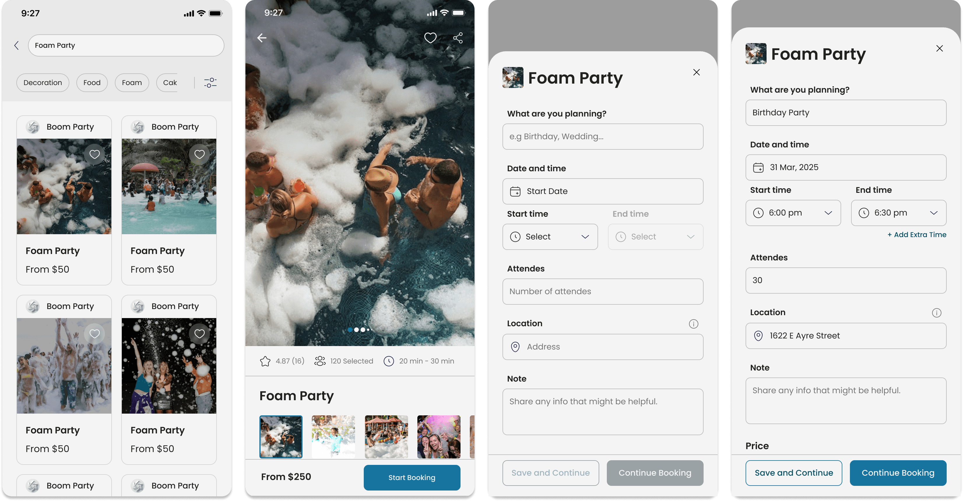
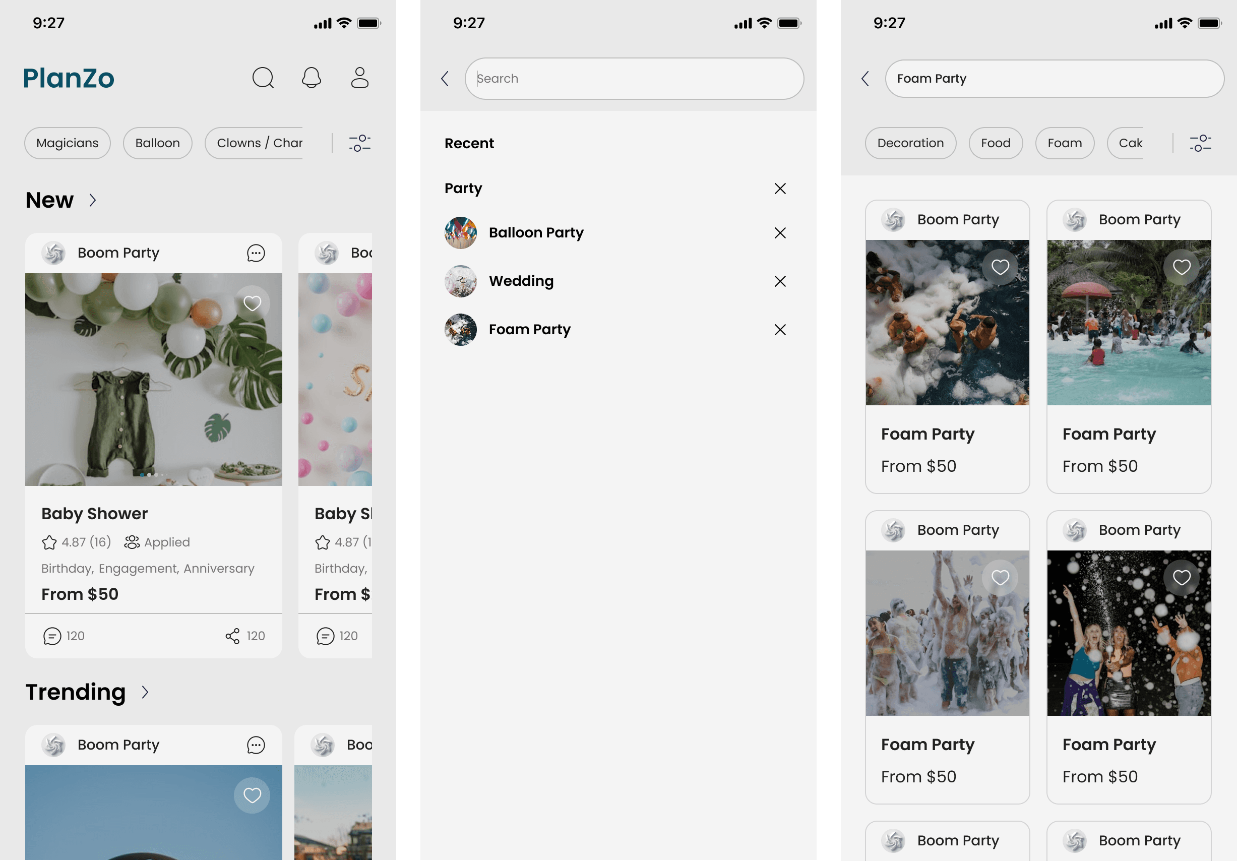
Low-Fidelity Wireframe
My goal with the low-fidelity wireframes was to stay grounded in the user’s experience. I translated the journey defined in the user flow into screens that prioritized simplicity, clarity, and task completion. This step helped validate the overall structure before adding visual detail in the next phase.

Mid-Fidelity Wireframes
After validating the structure through low-fidelity sketches, I moved on to creating mid-fidelity digital wireframes in Figma. This stage allowed me to refine content placement, interaction patterns, and navigation flow while still keeping the focus on usability over visual design.


Design Optimization for Desktop
After designing the mobile experience, I adapted PlanZo for desktop to ensure a responsive and seamless cross-device user experience. While maintaining consistency in branding and functionality, I optimized layouts for larger screens reorganizing navigation, spacing, and content blocks to enhance clarity and ease of use. This step allowed users to take full advantage of the desktop environment, especially for multitasking and detailed event planning tasks.


Branding
To visually express PlanZo's personality and purpose, I developed a branding system rooted in four core values: Accessibility, Capability, Joy, and Reliability. These principles guided every visual decision from color and typography to layout and tone of voice.
Mood Board
Before finalizing the visual style of PlanZo, I created a mood board to explore the emotion, tone, and visual direction of the brand. The goal was to ensure consistency between the brand values Accessibility, Capability, Joy, and Reliability and the visual language of the product.

This collection of colors, imagery, typography, and design elements helped guide decisions in the UI and supported a warm, user-friendly aesthetic that feels both trustworthy and joyful.
Logo Design
Now that I had a clear direction for PlanZo’s branding, I began by brainstorming around the brand’s core values Accessibility, Capability, Joy, and Reliability. I sketched quick logo ideas that captured the celebratory and approachable nature of the platform.

Style Tyle
To ensure visual consistency across PlanZo's interface, I created a style tile that brings together the foundational elements of the brand’s UI. It reflects the platform’s personality: accessible, joyful, capable, and reliable and serves as a reference point for building scalable components throughout the product.

Typography
The typeface Poppins was chosen for its modern, clean, and highly readable style. Its rounded letterforms add a friendly, approachable tone while supporting a professional look across both mobile and desktop platforms.

UI Kit
To ensure design consistency and streamline development, I created a UI Kit that includes the core components used throughout PlanZo. This kit is based on the visual direction established in the style tile and reflects the platform’s values of accessibility, capability, joy, and reliability.

Usability Testing
To evaluate the usability and effectiveness of PlanZo’s core features, I conducted remote, moderated, and one-on-one usability testing sessions. Users were asked to think aloud sharing what they were doing, thinking, and feeling as they interacted with the clickable prototype.
I focused the tests around the key flows identified earlier in the process. Each participant was asked to complete tasks such as:
Browsing a general category of services
Finding a specific vendor or item
Booking a service and checking out
Overview
Method: Remote, moderated usability testing (maze.co)
Participants: 6
Age range: 20–40 years old
Average Time: 208.4 seconds
Task Completion Rate: 95%
Error-Free Rate: 46.8%

The results provided both quantitative data (completion and error-free rates) and qualitative insights (behavioral observations and comments), which informed the next round of design improvements.
High-Fidelity Prototyping
After validating the core structure and interactions through mid-fidelity wireframes and usability testing, I moved on to develop the high-fidelity prototype of PlanZo. This version brought together all final branding elements color palette, typography (Poppins), UI kit components, and polished micro interactions into a realistic, clickable prototype.
Welcome to PlanZo

Analyzing and Prioritizing Test Results
During usability testing, several unexpected pain points emerged that weren’t originally anticipated in earlier phases. These insights helped guide future iterations to better align the product with user expectations: Unclear Payment Process , Lack of Visual References in Service Feedback ,Overwhelming Process for Multiple Bookings.
Iteration
After analyzing the results of usability testing and deciding which changes were most important, I updated the interface and created high-fidelity mockups that are ready for developer handoff. These final designs are based on everything I learned during the process -> from interviews to testing -> and focus on giving users a smooth, enjoyable, and reliable event planning experience.
View Final Prototype